A Good design is being able to translate a rather complex idea/message into visual, audio, or literary terms for a specific target audience.
With respect to the visual aspect, good design is having a good color scheme, attention grading, easy on the eyes visuals (controversial images, the grid system, etc.).
An example, of all these things taking into consideration in creating a great design, is the Häagen-Dazs website.

We can see these aspects of visual designs being put to use on this website. For instance, the grid system, great color scheme, and “soft” looking visuals that fits the “feel” of the ice cream.
Audio is a very challenging form because it is difficult to master. We are saturated by noise in our everyday lives. With respect to audio, good design is having “important” familiar sounds played out to get attention. For example, vocals of a well-known artists/actor, sound of fire alarm truck, or someone that is well known within our society, like President Obama, are all “important” familiar sounds that can be uses to create a good design. Music plays an important role also, however not every one have the same taste in music. In that case, familiar sounds should be used with caution unless you are targeting a specific audience.
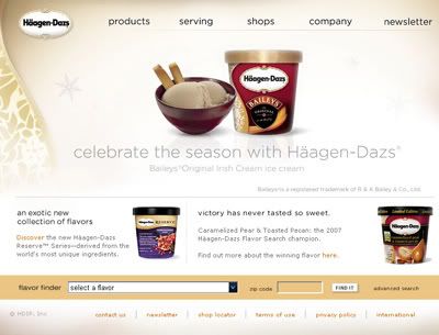
We can see these aspects of visual designs being put to use on this website. For instance, the grid system, great color scheme, and “soft” looking visuals that fits the “feel” of the ice cream.
Audio is a very challenging form because it is difficult to master. We are saturated by noise in our everyday lives. With respect to audio, good design is having “important” familiar sounds played out to get attention. For example, vocals of a well-known artists/actor, sound of fire alarm truck, or someone that is well known within our society, like President Obama, are all “important” familiar sounds that can be uses to create a good design. Music plays an important role also, however not every one have the same taste in music. In that case, familiar sounds should be used with caution unless you are targeting a specific audience.
With respect to the literary aspect, Good design is to have good typography with the appropriate colors, font size, spacing, balance and contrast, which can carries the mood/feeling of the message effectively to the individuals that will be receiving it. Here are some examples of great typography in its creative form.


A great design triggers emotions and sensations that the receiver of the message didn’t expect to feel, happy, inspire, sad, lonely, etc. It is the composition and presentation of the overall design that can generate these feelings inside of us. It is not the visuals or the audio alone that plays the part of carrying this message, it is the overall part of the design machine, visual/audio/typography and its gears, color, balance, content, contrast, words, spacing, etc, that are responsible in creating a working design.


